

Calrec scoops third Argo win with NAB Show Product of the Year 2024 Award for tailored version of Argo S
CBC launches new Spring/Summer 2024 podcast slate

Mandarin Series BREEZE BY THE SEA, helmed by Peter Ho, starring Bolin Chen and Puff Kuo releases First Look

Samsung TV Plus brings SURFER FAST Channel to surfing enthusiasts in Australia
Latest News
Calrec scoops third Argo win with NAB Show Product of the Year 2024 Award for tailored version of Argo S
Calrec has announced the benefits of its highly flexible approach to customer service has been recognized with a third award for the Argo range. The development of a specially tailored […]
CBC launches new Spring/Summer 2024 podcast slate
CBC, Canada’s #1 Canadian podcaster, is launching a new spring and summer slate of original CBC Podcasts, featuring in-depth investigations spanning the globe and personal storytelling reflecting timely topics and issues. CBC’s […]

Mandarin Series BREEZE BY THE SEA, helmed by Peter Ho, starring Bolin Chen and Puff Kuo releases First Look
CJ ENM Hong Kong, the regional office of leading entertainment company CJ ENM, together with Central Motion Picture Corporation and Deepwaters Digital Support Inc unveils the first three stills from the new Mandarin series BREEZE BY THE SEA, which […]
Samsung TV Plus brings SURFER FAST Channel to surfing enthusiasts in Australia
The large, avid surfing fan base in Australia and New Zealand will enjoy the ride of its life when hundreds of hours of surfing-related programming launches: SURFER. Created and serviced by acTVe, […]
DDish TV LLC Chooses PlayBox Neo Channel-in-a-Box for Broadcast Network Expansion
PlayBox Neo announces the completion of a new multichannel playout system for the DDish direct-to-home satellite television network in Mongolia. Based in the national capital, Ulaanbaatar, DDish broadcasts over 150 […]

JioCinema set to redefine subscription market with launch of Premium Plans
With the phenomenal success of the Indian Premier League and an award-winning entertainment offering, JioCinema has established itself as a destination for premium entertainment in every Indian household. Now, solving for key […]
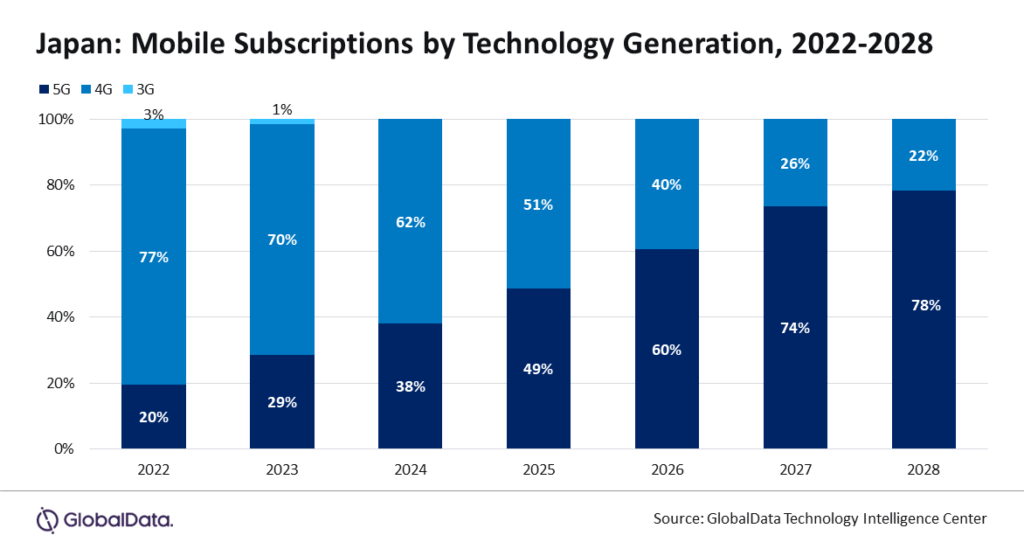
Telecom and pay-TV services revenue in Japan to increase at 2.1% CAGR over 2023-2028, forecasts GlobalData
The total telecom and pay-TV services revenue in Japan is expected to increase at a compound annual growth rate (CAGR) of 2.1% from $97.6 billion in 2023 to $108.3 billion […]

UKTV has announced the commission of the brand-new series, Mudtown, for its leading crime drama channel, Alibi.
UKTV today announces the commission of the brand-new series, Mudtown (6×1 hour), for its leading crime drama channel, Alibi. The six-part series is a co-commission with Welsh language free-to-air channel S4C and All3Media International. The series is produced […]
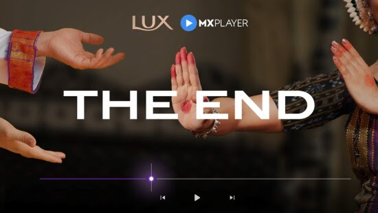
LUX And MX Player Partner To Challenge Outdated Sexist Scenes With An Innovative Campaign ‘The End’
VML Singapore and LUX, the global beauty brand under Unilever, has partnered with MX Player, a leading OTT platform, to launch a fresh new campaign that tackles a deeply ingrained […]

CAKE signs deal with ITVX on animated comedy adventure The Guava Juice Show
Leading kids’ entertainment specialist CAKE has announced a deal with ITV on two seasons of animated comedy adventure The Guava Juice Show (26 x 11’). Produced by Vancouver-based Mainframe Studios […]

Ricky Ow Joins Viddsee’s Board of Directors, Enhancing the Entertainment Platform’s Strategic Vision
In a move to bolster its platforms, Viddsee, the leader in digital storytelling and independent filmmaking, is thrilled to welcome media veteran Ricky Ow to its Board of Directors. Ow, […]

PubMatic partners with Nova to transform social posts into ads for any digital channel
PubMatic, an independent technology company delivering digital advertising’s supply chain of the future, has today announced a partnership with Nova, the leading creative AI company in social display, high impact, video […]
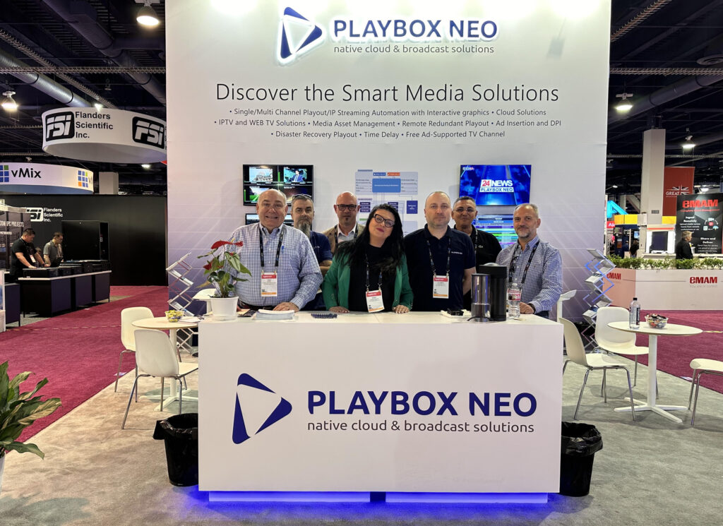
PlayBox Neo Highlights Latest Advances in Smart Media Playout at April 2024 NAB Show
PlayBox Neo reports a successful and well attended 2024 NAB Show, held in mid April at the Las Vegas Convention Center. Now in its 101st year, the event attracted nearly […]